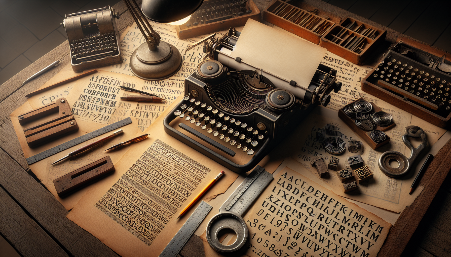
Typography is more than just selecting a font for a project; it is an art form that conveys emotions, shapes perceptions, and creates lasting impressions. In the world of vintage design, where nostalgia meets creativity, fonts hold an unparalleled power. They evoke a sense of time and place, transporting us to eras gone by with a mere glance. But how exactly does typography influence our perceptions and emotions, especially in the realm of vintage design? This question opens up a fascinating exploration of the interplay between visual aesthetics and human psychology—a journey into understanding how the fonts of yesteryear continue to impact us today.
In vintage design, every font choice is a deliberate decision, crafted to evoke a particular era’s mood and atmosphere. Whether it’s the bold, ornate letters of Art Deco or the whimsical scripts of the 1950s, each style carries its own unique set of connotations and emotional triggers. These fonts are more than just decorative elements; they are storytellers, whispering tales of elegance, innovation, and cultural shifts. This article will delve into the history and characteristics of key vintage font styles, shedding light on how designers harness their power to evoke specific emotional responses. Through a blend of historical insights and psychological analysis, we will uncover why certain fonts resonate more deeply than others and how they can transform a design from mere visual communication into an emotional experience.
Moreover, the influence of typography extends beyond mere aesthetics; it affects the way information is perceived and processed by the viewer. For instance, the choice of a serif font might communicate tradition and reliability, while a sans-serif could suggest modernity and efficiency. In vintage design, these subtleties are amplified, as the font becomes a bridge connecting past and present. This article will explore the psychological underpinnings of typography, examining how font choices can manipulate perceptions and elicit specific emotional responses. By understanding these dynamics, designers and enthusiasts alike can make informed choices that enhance the impact of their work, creating pieces that are not only visually appealing but also emotionally engaging.
As we unravel the power of fonts in vintage design, we will also address practical considerations for modern-day application. How can one effectively incorporate vintage typography into contemporary projects without losing authenticity or relevance? What are the common pitfalls to avoid, and how can designers strike a balance between nostalgia and innovation? By the end of this article, you will not only have a deeper appreciation for the role of typography in shaping perceptions and emotions but also practical insights to enhance your own design endeavors. Whether you’re a seasoned designer, a typography enthusiast, or simply curious about the magic of vintage design, this exploration promises to be both enlightening and inspiring. Let’s embark on this journey to uncover the hidden stories behind the fonts that have shaped our visual culture. ✨
Understanding the Power of Fonts in Vintage Design
Typography is an art form that transcends the mere presentation of words. In the realm of vintage design, fonts have the unique ability to evoke specific emotions and perceptions. By understanding the nuances of different fonts, designers can effectively communicate themes of nostalgia, elegance, and timelessness. The choice of typeface in vintage design isn’t just about aesthetics; it’s about creating a narrative that resonates deeply with the audience.
Fonts in vintage design often carry historical significance, reflecting the era they originated from. For instance, the bold, ornamental fonts of the Victorian era speak to a time of opulence and grandeur, while the sleek, minimalist fonts of the mid-20th century evoke a sense of modernity and forward-thinking. Each typeface brings with it a rich tapestry of cultural and historical associations that designers can leverage to create a compelling visual experience.
The emotional impact of typography in vintage design cannot be understated. Different fonts can provoke a wide range of emotions, from nostalgia and warmth to intrigue and curiosity. By carefully selecting and pairing fonts, designers can craft a visual story that draws viewers in and leaves a lasting impression. Whether it’s the romantic allure of a script font or the authoritative presence of a serif typeface, each choice contributes to the overall mood and message of the design.
The Historical Influence of Fonts in Vintage Design
The evolution of typography has been closely linked to technological advancements and cultural shifts. During the Industrial Revolution, the invention of the printing press led to the proliferation of typefaces, each designed to capture the spirit of the times. This era saw the emergence of decorative, elaborate fonts that reflected the ornate aesthetic preferences of the period.
In the early 20th century, as Art Nouveau gave way to Art Deco, typography underwent another transformation. The geometric, streamlined fonts of the Art Deco movement mirrored the era’s fascination with modernity and progress. These typefaces were characterized by their clean lines and symmetry, embodying a sense of sophistication and elegance that continues to influence designers today.
The mid-century modern movement brought with it a shift towards simplicity and functionality. Sans-serif fonts became increasingly popular, representing a departure from the complexity of earlier typefaces. This minimalist approach to typography emphasized clarity and legibility, aligning with the broader design ethos of the time. The enduring appeal of these fonts lies in their versatility and timelessness, making them a staple in vintage-inspired designs.
How Typography Influences Perception and Emotions
The psychological impact of typography is a fascinating area of study, particularly in the context of vintage design. Fonts have the power to influence how a message is perceived and the emotions it elicits in the viewer. Serif fonts, for instance, are often associated with tradition, reliability, and authority. Their classic appearance lends a sense of credibility and gravitas to any design.
In contrast, sans-serif fonts convey modernity and simplicity. Their clean lines and absence of embellishments make them ideal for designs that prioritize clarity and functionality. These fonts are often used in contemporary vintage designs that aim to blend old-world charm with modern sensibilities.
Script fonts, with their flowing, cursive forms, evoke a sense of elegance and romance. They are frequently used in designs that seek to capture the allure of a bygone era, such as wedding invitations or luxury branding. The emotional impact of script fonts is profound, as they tap into a sense of nostalgia and warmth.
Practical Applications of Typography in Vintage Design
Designers who specialize in vintage aesthetics understand the importance of font selection in conveying the desired mood and message. A well-chosen typeface can transform a simple design into a powerful storytelling tool. When working on vintage projects, designers often consider the historical context and cultural associations of each font to ensure it aligns with the overall theme.
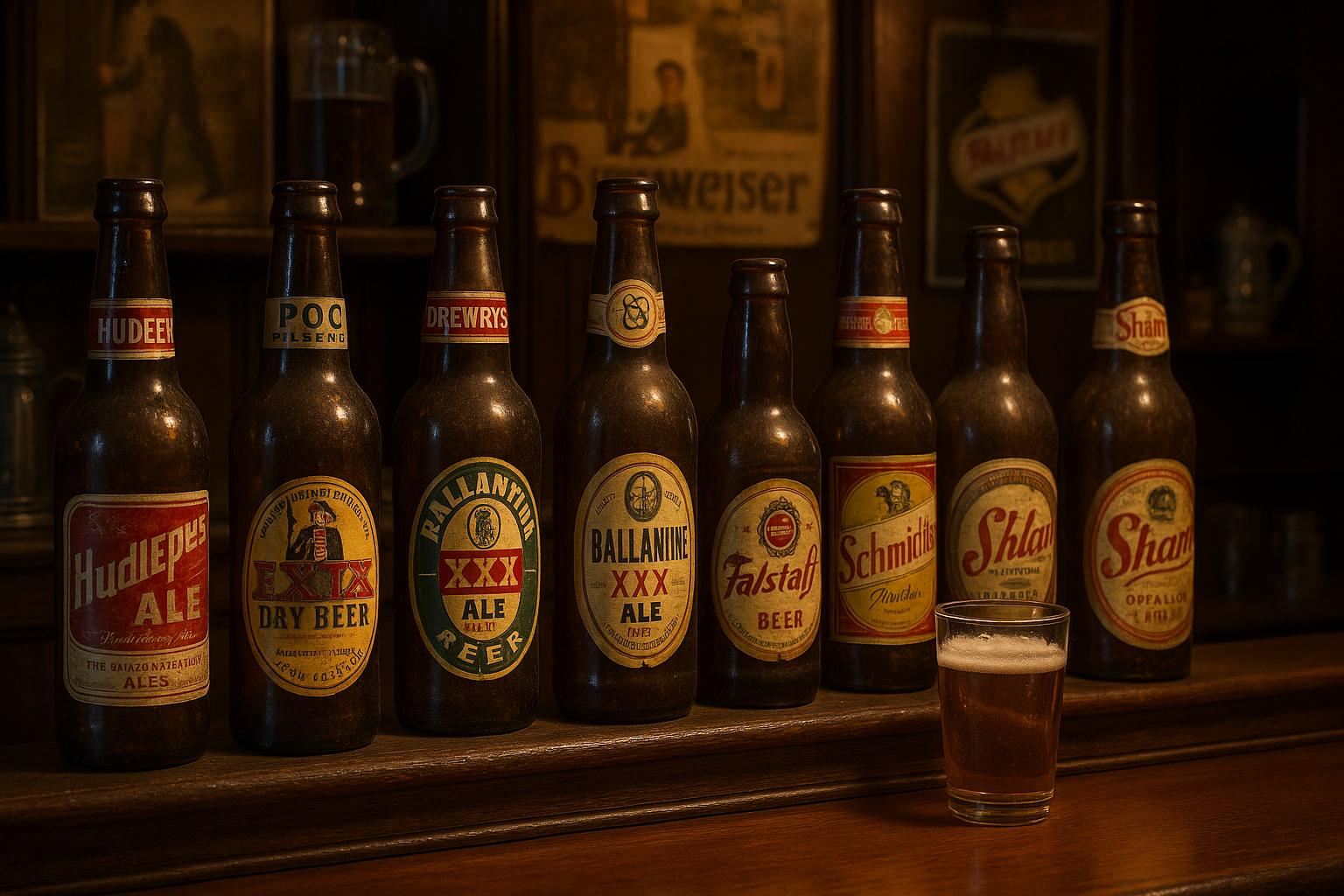
One practical application of typography in vintage design is in branding. Companies that wish to evoke a sense of heritage and authenticity often choose fonts that reflect the era in which they were founded. For example, a brewery with a long history might opt for a Victorian-style font to highlight its longevity and tradition.
In packaging design, typography plays a crucial role in capturing the essence of the product. Vintage-inspired packaging often features ornate fonts that draw the eye and create a sense of nostalgia. These designs are particularly effective in industries such as food and beverage, where the visual appeal of the packaging can significantly influence consumer perceptions.
| Font Style | Emotional Impact | Example Uses |
|---|---|---|
| Serif | Tradition, Reliability | Book Covers, Official Documents |
| Sans-serif | Modernity, Simplicity | Web Design, Corporate Logos |
| Script | Elegance, Romance | Wedding Invitations, Luxury Branding |
Pairing Fonts for Maximum Impact
Effective font pairing is an essential skill for designers working with vintage aesthetics. Combining complementary typefaces can enhance the overall design, creating a harmonious and visually appealing composition. When pairing fonts, designers often consider factors such as contrast, hierarchy, and readability.
Contrast is a key element in font pairing. By choosing fonts with different weights, styles, or sizes, designers can create visual interest and draw attention to specific elements of the design. For instance, pairing a bold serif font with a delicate script can create a striking juxtaposition that captures the viewer’s attention.
Hierarchy is another important consideration in font pairing. Designers use typography to guide the viewer’s eye through the design, emphasizing key messages and creating a logical flow. By varying font sizes and styles, designers can establish a clear visual hierarchy that enhances readability and comprehension.
To see these principles in action, watch the video below:
Typography in Vintage Design – The Creative Academy
The Future of Typography in Vintage Design
As design trends continue to evolve, typography remains a vital component of vintage aesthetics. While the core principles of font selection and pairing remain consistent, new technologies and design tools are expanding the possibilities for creative expression. Variable fonts, for example, offer designers greater flexibility and control over typographic elements, allowing for more personalized and dynamic designs.
The rise of digital platforms has also influenced typography in vintage design. With the increasing importance of digital media, designers are exploring new ways to integrate traditional typefaces into modern contexts. This fusion of old and new creates a unique design language that resonates with contemporary audiences while honoring the rich history of typography.
In conclusion, the power of fonts in vintage design lies in their ability to convey emotion, tell stories, and create a lasting impression. By understanding the nuances of different typefaces and their historical significance, designers can craft visually compelling designs that resonate with audiences on a deep, emotional level.
- Explore the historical roots of different typefaces.
- Experiment with font pairing to enhance your designs.
- Stay updated on the latest trends in typography.
Conclusion
In conclusion, the exploration of typography’s profound influence on perception and emotions, especially within the realm of vintage design, unveils an often underestimated power. This article has traversed through the intricate ways in which fonts communicate beyond the mere conveyance of words, shaping our emotional responses and perceptions of authenticity, nostalgia, and trust. Through a deep dive into historical contexts, we have seen how vintage typography evokes a sense of time travel, taking us back to different eras with its distinct styles and characteristics.
The discussion began by highlighting the intrinsic relationship between typography and emotion. Fonts, much like colors and imagery, carry emotional weight and can evoke feelings ranging from excitement to calmness, trust to curiosity. This connection is particularly significant in vintage design, where the choice of typeface can transport the audience to a bygone era, eliciting nostalgia and a sense of familiarity. This emotional engagement is a powerful tool for brands and designers aiming to connect with their audience on a deeper level.
We also explored the psychology of fonts, delving into how specific typefaces can influence perceptions of a brand or product. Serif fonts, often associated with tradition and reliability, contrast with the modern and clean aesthetic of sans-serif fonts. Script and decorative fonts, on the other hand, bring in a personalized, artistic touch. Understanding these associations is crucial for designers aiming to align their typography choices with the intended message and audience expectations.
Moreover, the article emphasized the cultural and historical significance of typography in vintage design. The resurgence of interest in retro and vintage aesthetics in contemporary design showcases how these styles resonate with audiences today. Vintage typography not only appeals aesthetically but also serves as a bridge connecting modern audiences with historical narratives and cultural heritage. The stories told through typefaces can reinforce a brand’s identity and values, making typography a strategic component in design.
The practical applications of these insights were also discussed. Designers and brands can leverage typography to enhance their storytelling, create emotional connections, and differentiate themselves in a crowded marketplace. By carefully selecting typefaces that align with the desired emotional response and brand identity, designers can craft compelling narratives that resonate with their audience. This strategic use of typography becomes a vital part of brand communication and marketing strategies.
Further reading and exploration:
– A Brief History of Typography
– The Psychology of Fonts
– The Impact of Typography on User Experience
These resources offer additional insights into the history, psychology, and application of typography, providing a broader understanding of its role in design. As always, ensure to verify the content and current status of these resources, as the online landscape is continually evolving.

Toni Santos is a visual poet and botanical dreamweaver, archiving the ephemeral beauty of dreams through nature’s delicate language.
In his artistic universe, every petal, vine, and root becomes a memory—an echo from the subconscious—preserved in time like pages from an ethereal journal. Toni treats plants not just as living beings, but as dream-symbols: vessels of forgotten feelings, silent wishes, and secret stories waiting to unfold.
His work is rooted in the belief that nature holds the vocabulary of dreams. Through botanical compositions, symbolic floral creations, and enchanted visual studies, he gives form to the unseen — the moment between sleep and wakefulness, where memory fades and imagination begins.
As the visionary behind Vizovex, Toni curates collections that feel like fragments of a dreamscape: moss-filled glass jars, mythic flowers, ancient botanical symbols reimagined. These creations invite you to explore your inner worlds and reawaken your sense of wonder.
His work is a tribute to:
The dreamlike language of plants and natural symbols.
The quiet messages found in forgotten moments.
The art of recording the soul’s memories in organic form.
Whether you’re a seeker of meaning, a lover of myth, or someone who drifts between the symbolic and the real, Toni welcomes you to explore an archive of dreams — one petal, one relic, one timeless whisper at a time