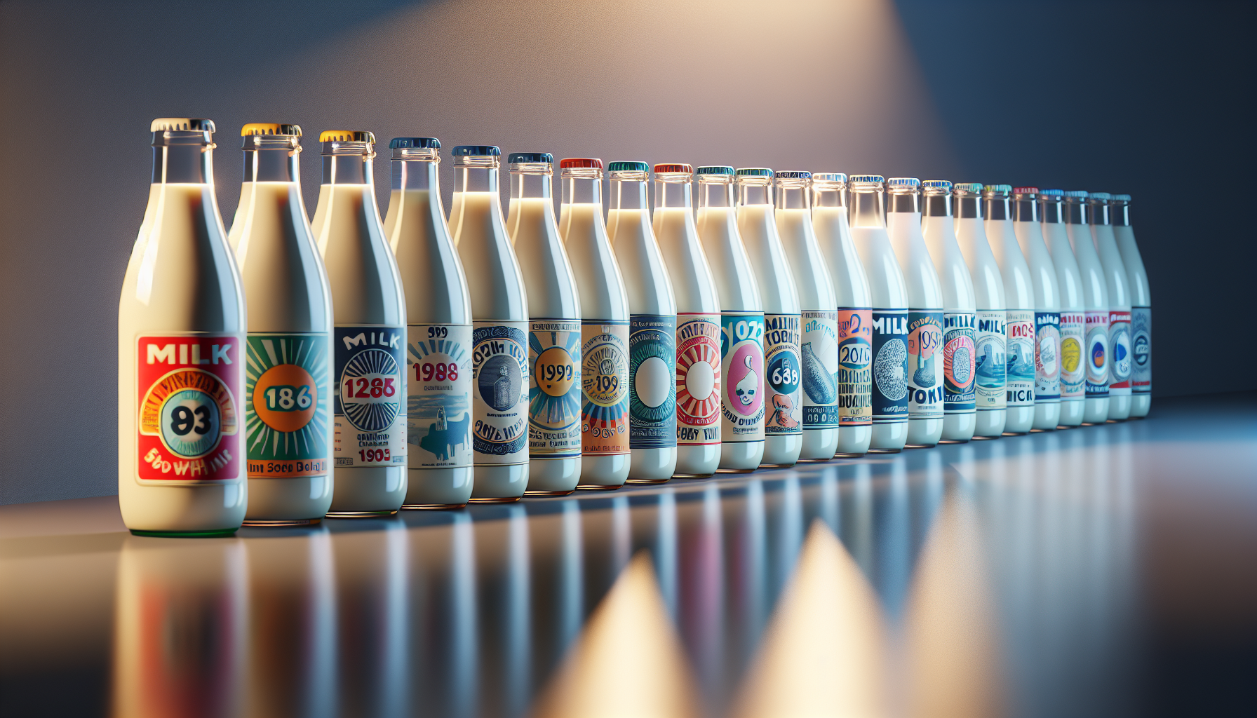
In the vast and ever-evolving landscape of consumer goods, few items hold as nostalgic a place in our hearts and homes as the humble milk bottle. From the clinking sound of glass bottles on early morning doorsteps to the familiar sight of cartons in our refrigerators, milk has been a staple in households across the globe for generations. Yet, while the content of these bottles has remained relatively consistent, the labels adorning them have undergone a fascinating transformation. This metamorphosis from simple, utilitarian designs to vibrant and playful works of art mirrors broader shifts in marketing, consumer preferences, and cultural trends. 🥛
In this exploration of milk bottle label evolution, we embark on a journey through time and aesthetics. Our journey begins in the early 20th century, a period when milk distribution was localized, and the focus was on practicality and brand identification. These early labels, often monochromatic and straightforward, were designed to convey basic information such as the dairy’s name and the milk’s grade. However, as we move through the decades, we witness the labels becoming canvases of creativity, reflecting the artistic movements and technological advancements of their times. From the minimalist designs of the 1920s to the bold, colorful graphics of the 1960s, and the retro-inspired nostalgia of today, each era tells its own story through the lens of milk bottle art.
As we delve deeper, we will examine how these labels have not only adapted to artistic trends but have also played a crucial role in brand differentiation and consumer engagement. In a market flooded with choices, a milk bottle’s label has become a vital tool for catching the eye of potential buyers and conveying the brand’s unique identity. We’ll explore how companies have harnessed the power of design and psychology to create labels that are not just visually appealing but also emotionally resonant, making a simple grocery store item a part of a larger narrative. 🎨
Furthermore, we’ll discuss the impact of technology and sustainability on the evolution of milk bottle labels. The rise of digital printing techniques has allowed for greater flexibility and creativity in design, enabling intricate patterns and vibrant colors that were once impossible. At the same time, an increasing awareness of environmental issues has pushed brands to reconsider their packaging choices, leading to innovations in eco-friendly materials and designs that communicate a commitment to sustainability. We’ll highlight key examples of brands that have successfully merged aesthetic appeal with ethical responsibility, setting new standards in the industry.
Finally, our exploration wouldn’t be complete without a look into the future. What trends can we anticipate in the coming years? How will the interplay of technology, consumer preferences, and environmental considerations continue to shape the world of milk bottle labels? Through expert insights and industry predictions, we’ll provide a glimpse into what lies ahead, ensuring that this journey is not just a retrospective but a forward-thinking exploration of possibilities.
By the end of this article, you will not only have gained a deeper appreciation for the art and science behind milk bottle labels but also a newfound perspective on how such seemingly mundane items can reflect the zeitgeist of their times. So, pour yourself a glass of milk, sit back, and join us as we unveil the playful evolution of these everyday masterpieces. 🥛📜
Understanding the Historical Context of Milk Bottle Labels
The evolution of milk bottle labels is a fascinating journey that mirrors broader societal changes, technological advancements, and shifts in marketing strategies. Initially, milk bottles were primarily functional, with little regard for aesthetics or branding. The focus was on delivering milk safely and efficiently to consumers. As pasteurization became widespread in the late 19th and early 20th centuries, the dairy industry began to see the potential of branding their products. This was the start of milk bottle labels evolving from plain to playful, embodying the cultural and technological shifts of their times.
In the early 1900s, milk bottles were often embossed with simple text indicating the dairy’s name and location. The lack of color and design was due to the technological limitations of the time and the fact that milk was often delivered directly from local farms. However, as urbanization increased, the need for differentiation among competing dairies became more pressing. This led to the introduction of more intricate labels, which started to incorporate logos, colors, and slogans. These changes were not only about branding but also about ensuring consumers of the milk’s quality and safety, which became a significant selling point as food safety regulations became stricter.
By the mid-20th century, the advent of modern printing techniques allowed for greater creativity and complexity in label designs. Dairies could now use a broader color palette, detailed imagery, and even incorporate playful elements to attract consumers. This era saw a boom in the use of cartoon characters, vibrant colors, and catchy slogans. The labels became not just a means of identification but a tool for engaging consumers and creating brand loyalty. As marketing strategies evolved, so too did the messages conveyed by these labels, reflecting the changing values and aspirations of society.
Technological Advancements in Label Printing
The technological advancements in label printing have played a crucial role in the evolution of milk bottle labels. Initially, the labels were simple paper tags attached to the bottle necks, often printed using basic lithography. As technology progressed, so did the complexity and durability of the labels. The introduction of offset printing in the mid-20th century allowed for high-quality, mass-produced labels that could withstand the rigors of transportation and refrigeration without degrading.
Screen printing and flexographic printing brought further innovations, enabling the use of a wider range of colors and more intricate designs. These techniques also allowed for the use of different materials such as waterproof and tear-resistant papers, which were essential for maintaining the label’s integrity throughout the product’s lifecycle. The evolution of printing technologies not only improved the aesthetic appeal of milk bottle labels but also their functionality, ensuring they could convey important information such as nutritional content, expiry dates, and even promotional messages.
Today, digital printing has revolutionized the industry by allowing for even greater customization and faster production times. This has opened up new possibilities for creative expression and personalized marketing strategies. With digital printing, dairies can produce limited edition labels, incorporate QR codes for interactive experiences, and even use augmented reality to engage consumers in novel ways. This technological evolution highlights how milk bottle labels have transitioned from purely functional items to dynamic tools for consumer engagement.
Design Elements that Make Labels Stand Out
The design of milk bottle labels has become an art form in itself, with designers leveraging a range of elements to make their products stand out on crowded supermarket shelves. Color is one of the most critical aspects, with certain hues being associated with freshness, health, and naturalness. Blue and green tones, for example, are commonly used to evoke a sense of calm and purity, while red and yellow can create a sense of urgency or energy.
Typography is another crucial element, with fonts chosen to reflect the brand’s personality and target audience. A vintage-style serif font might be used to convey tradition and reliability, while a modern sans-serif could suggest innovation and simplicity. The placement and size of text are also carefully considered to ensure legibility and impact. It’s not just about the words themselves, but how they are presented in harmony with other design elements.
Imagery, whether photographs, illustrations, or graphics, can be used to convey messages about the product’s origin, quality, and benefits. Many labels incorporate pastoral scenes or images of cows to emphasize the natural and wholesome nature of milk. The use of mascots or characters can also add a playful element, making the product more relatable and memorable to consumers, especially children. Effective label design is about creating an emotional connection with the consumer, telling a story that resonates on both a conscious and subconscious level.
Table: Key Elements in Milk Bottle Label Design
| Element | Description | Impact |
|---|---|---|
| Color | Used to evoke specific emotions and associations | Influences consumer perception and decision-making |
| Typography | Fonts and text layout that reflect brand identity | Enhances readability and aesthetic appeal |
| Imagery | Photos or illustrations that convey product values | Creates an emotional connection with consumers |
To see how these elements come together in modern designs, watch the video below:
The Art of Milk Bottle Labels – Design Trends (Channel: Creative Packaging)
Marketing Strategies and Consumer Engagement
The role of milk bottle labels in marketing strategies has evolved significantly over time. Initially, the primary goal was to differentiate one brand from another. However, as competition intensified, labels became a critical component of broader marketing campaigns. Modern labels are designed to engage consumers on multiple levels, utilizing a mix of visual appeal, interactive elements, and informative content to build brand loyalty and encourage repeat purchases.
One popular strategy is the use of storytelling through label design. By creating a narrative around the product, brands can forge a deeper connection with consumers. This could involve highlighting the product’s origin, the ethical practices of the dairy, or the health benefits of the milk. Labels may also feature limited-time offers, recipes, or QR codes that link to digital content such as videos or social media campaigns. These elements not only enhance the consumer’s experience but also provide opportunities for engagement beyond the initial purchase.
- Consider the emotional impact of color choices in label design.
- Utilize typography to reinforce brand identity and messaging.
- Incorporate imagery that aligns with product values and consumer expectations.
- Leverage interactive elements to create engaging consumer experiences.
Conclusion
As we draw our exploration of “From Plain to Playful: The Evolution of Milk Bottle Labels Revealed!” to a close, it’s evident that the journey of milk bottle labels reflects broader societal changes and technological advancements. We’ve traversed through history, witnessing how these labels transitioned from simple and utilitarian to complex works of art that capture the essence of branding and consumer engagement.
Initially, milk bottles served purely functional purposes, with labels providing essential information such as source, date, and price. However, as the marketing landscape evolved, so did the art of labeling. The introduction of vibrant colors, engaging graphics, and innovative design techniques transformed milk bottles into powerful marketing tools. This evolution not only highlights advancements in printing technology but also underscores the importance of branding in consumer decision-making processes.
In our discussion, we highlighted several key trends. The shift from monochrome to color, the inclusion of playful mascots, and the incorporation of storytelling elements have all contributed to the modern label’s ability to capture consumer attention. Moreover, the rise of digital printing and sustainable packaging solutions showcases the industry’s response to environmental concerns and the need for personalization in a competitive market.
The evolution of milk bottle labels is more than a story of marketing ingenuity; it is a testament to the dynamic interplay between tradition and innovation. It reflects how companies have adapted to changing consumer preferences and societal values, all while maintaining a connection to the past. The labels are now not only informative but also serve as a medium for expression and connection, resonating with audiences in new and meaningful ways.
The importance of this topic extends beyond the realm of design and branding. It offers valuable insights into how industries can embrace change while honoring their heritage. For entrepreneurs, designers, and marketers, there is much to learn from the adaptability and creativity demonstrated in this niche of the packaging world. It is a reminder that even the most commonplace items can become canvases for innovation and storytelling.
As we conclude, I invite you to reflect on the journey we’ve taken together. Consider how the lessons from milk bottle label evolution might apply to your own field or interests. The ability to adapt, innovate, and engage with your audience in meaningful ways is a universal challenge, and the story of milk bottle labels provides a unique lens through which we can explore these themes.
I encourage you to share your thoughts and insights on this fascinating topic. Whether you are inspired by the creativity of label designs or intrigued by the historical progression, your perspective is valuable. Engage with us by leaving a comment below, sharing this article with others, or applying the principles discussed to your own projects.
Together, let’s continue the conversation and celebrate the ingenuity that turns the ordinary into the extraordinary. The evolution of milk bottle labels is a testament to human creativity and resilience, and it serves as an inspiring reminder of the endless possibilities that await when we embrace change and let our imaginations soar. 🥛✨

Toni Santos is a visual poet and botanical dreamweaver, archiving the ephemeral beauty of dreams through nature’s delicate language.
In his artistic universe, every petal, vine, and root becomes a memory—an echo from the subconscious—preserved in time like pages from an ethereal journal. Toni treats plants not just as living beings, but as dream-symbols: vessels of forgotten feelings, silent wishes, and secret stories waiting to unfold.
His work is rooted in the belief that nature holds the vocabulary of dreams. Through botanical compositions, symbolic floral creations, and enchanted visual studies, he gives form to the unseen — the moment between sleep and wakefulness, where memory fades and imagination begins.
As the visionary behind Vizovex, Toni curates collections that feel like fragments of a dreamscape: moss-filled glass jars, mythic flowers, ancient botanical symbols reimagined. These creations invite you to explore your inner worlds and reawaken your sense of wonder.
His work is a tribute to:
The dreamlike language of plants and natural symbols.
The quiet messages found in forgotten moments.
The art of recording the soul’s memories in organic form.
Whether you’re a seeker of meaning, a lover of myth, or someone who drifts between the symbolic and the real, Toni welcomes you to explore an archive of dreams — one petal, one relic, one timeless whisper at a time