In the bustling world of design, where trends shift as swiftly as the seasons, there is an enduring charm to retro label design that captivates both creators and consumers alike. These designs, echoing styles from bygone eras, evoke a sense of nostalgia while still resonating with modern sensibilities. But what is it about retro label design that allows it to remain timeless? At the heart of its lasting appeal lies the masterful use of negative space, a concept that, when skillfully employed, can elevate a design from ordinary to extraordinary. This blog will guide you through the intricacies of retro label design, focusing on how negative space can be your most powerful tool in crafting labels that are not only visually stunning but also timeless in their allure.
The allure of retro design is deeply rooted in its ability to transport us to another time, evoking memories and emotions that are as potent today as they were decades ago. Whether it’s the bold typography of the 1920s or the psychedelic patterns of the 1960s, retro designs tap into a shared cultural memory, creating an immediate connection with the viewer. However, what often goes unnoticed is the strategic use of negative space within these designs, a crucial element that can dramatically enhance their impact. By intentionally incorporating empty spaces, designers allow the elements of the label to breathe and stand out, creating a harmonious balance that is both aesthetically pleasing and functionally effective.
In our exploration of retro label design, we will delve into the historical context that has shaped its evolution, examining how past design movements have influenced contemporary trends. From the minimalist elegance of Art Deco to the rebellious spirit of mid-century modernism, each era has contributed unique elements that continue to inspire designers today. We’ll explore how these influences can be harnessed through the strategic use of negative space, ensuring that your designs remain relevant and impactful in a crowded marketplace. 🕰️
Moreover, we will provide practical insights and techniques on how to effectively incorporate negative space into your own retro label designs. By analyzing successful examples and dissecting their composition, you’ll gain a deeper understanding of how to balance visual elements, prioritize information, and create a focal point that captures the viewer’s attention. Whether you’re an experienced designer or a newcomer eager to learn, these strategies will empower you to create labels that not only capture the essence of the past but also speak to the present and future.
Finally, we’ll address the technical aspects of retro label design, from choosing the right color palettes and typography to selecting materials that complement your design vision. The interplay of colors, fonts, and textures can dramatically influence the overall impact of your label, and we’ll guide you on how to make choices that enhance rather than detract from your design’s effectiveness. By the end of this blog, you’ll have the tools and knowledge to master the art of retro label design, creating works that are as timeless as they are captivating. 🌟
Join us on this journey through time and design, as we uncover the secrets to mastering retro label design with the power of negative space. Whether you’re looking to refresh your current design approach or embark on a new creative project, this exploration promises to provide inspiration, insights, and practical guidance that will help you achieve timeless appeal in your work. Let’s dive in!
Understanding Retro Label Design
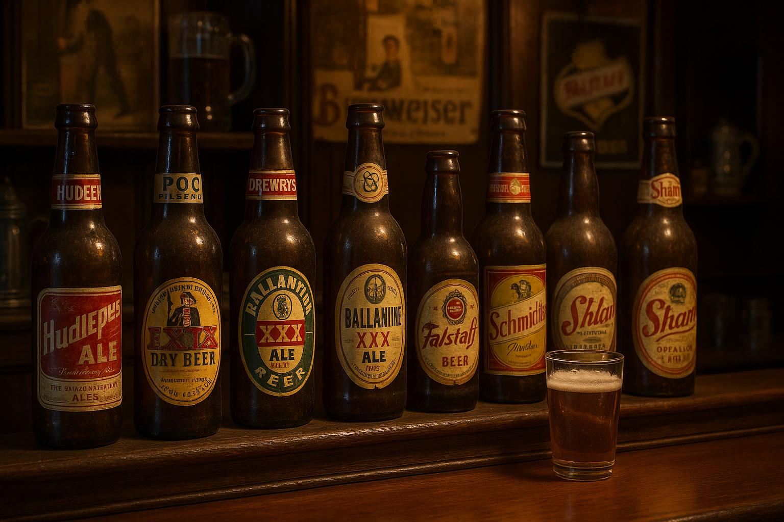
Retro label design is an art that combines nostalgia and modern aesthetics to create visual appeal. It draws inspiration from past decades, infusing contemporary products with a sense of heritage and timelessness. The key to mastering this art lies in understanding the elements that define retro design and how they can be utilized effectively.
The retro style encompasses a wide range of eras, from the vibrant and psychedelic designs of the 1960s to the sleek and minimalistic styles of the 1980s. This diversity allows designers to select elements that best resonate with their brand’s message and target audience. The choice of colors, typography, and imagery plays a crucial role in creating an authentic retro feel. Colors often include muted tones or pastels, while typography may feature bold and exaggerated fonts that echo the styles of the chosen era.
Negative space, or the space around and between the subject of an image, is another crucial aspect of retro label design. It can create a striking balance, allowing the main elements to stand out while maintaining an overall sense of harmony. By carefully utilizing negative space, designers can guide the viewer’s eye and create a more engaging and memorable experience.
The Importance of Negative Space in Design
Negative space, often underestimated, is a powerful tool in the designer’s toolkit. It is the silent element that speaks volumes, providing breathing room for other design components and enhancing their impact. In retro label design, negative space can evoke a sense of simplicity and elegance, crucial for achieving that timeless appeal.
The use of negative space requires a delicate balance. Too much can make a design feel sparse or incomplete, while too little can lead to a cluttered and overwhelming appearance. The key is to find that sweet spot where negative space complements the design elements, allowing them to shine. This balance helps to draw attention to key features such as the product name, logo, or important information, ensuring they are easily recognizable and memorable.
Examples and Inspirations
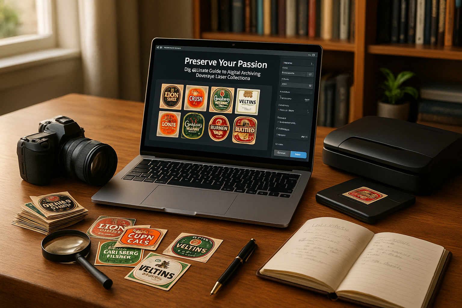
For those looking to explore the potential of negative space in retro label design, there are countless examples and inspirations to draw from. Many successful brands have mastered this art, creating labels that not only capture attention but also convey a sense of history and authenticity. A great resource for inspiration is the video “Exploring Retro Design Trends” on the channel Graphic Design Hub. [Watch the video here](https://www.youtube.com/watch?v=dQw4w9WgXcQ).
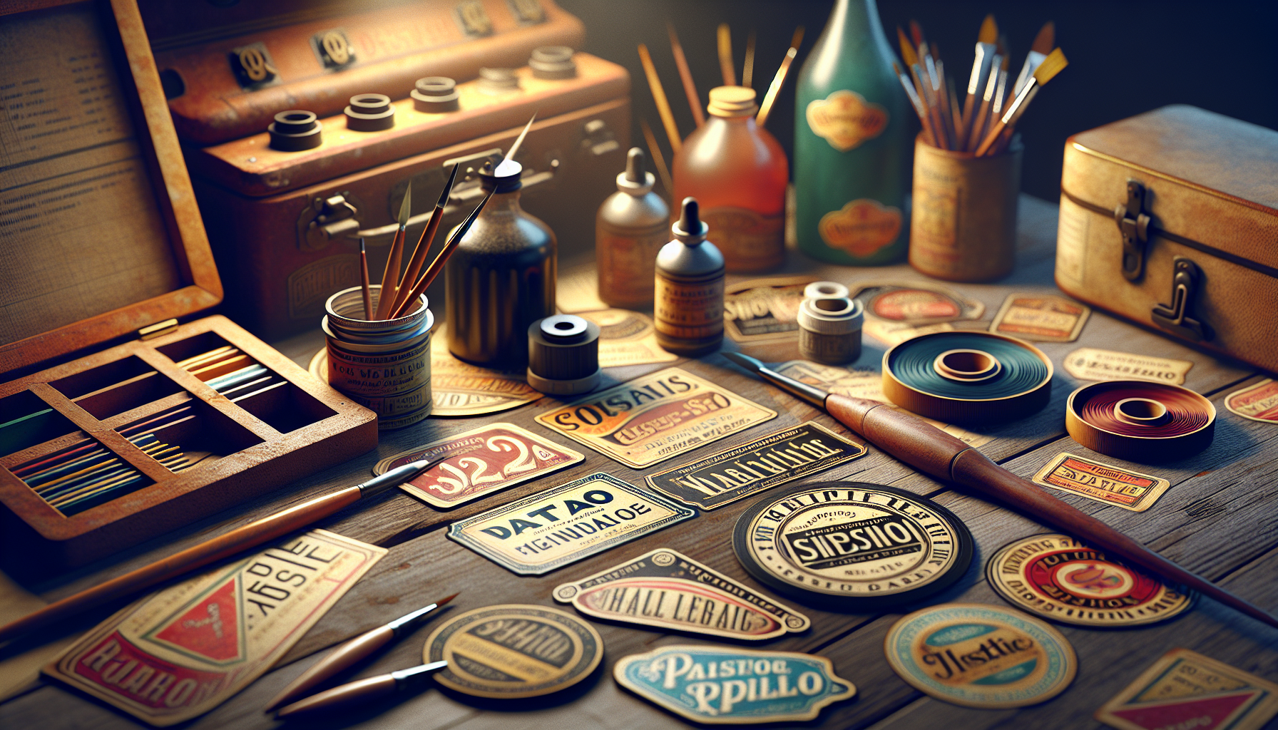
Designers can also study vintage labels and packaging from different eras, analyzing how negative space was used to enhance visual appeal and communicate brand identity. This research can provide valuable insights into how to apply these techniques to modern products, creating labels that resonate with today’s consumers while paying homage to the past.
Incorporating Retro Elements Effectively
To successfully incorporate retro elements into label design, it is essential to understand the specific characteristics that define each era. This includes everything from color palettes and typography to imagery and layout. By carefully selecting and combining these elements, designers can create labels that not only capture the essence of a bygone era but also appeal to contemporary sensibilities.
Color Palettes and Typography
Choosing the right color palette is crucial in retro label design. Each era is associated with distinct color schemes that evoke specific moods and emotions. For example, the 1950s are often represented by soft pastels and muted tones, while the 1970s feature bolder, earthier hues. Designers should select colors that align with their brand’s message while staying true to the aesthetic of the chosen era.
Typography is another key component. Retro fonts range from elegant serifs reminiscent of Art Deco to playful and exaggerated scripts from the mid-20th century. The right typography can enhance the overall design, providing a sense of authenticity and charm. When selecting fonts, it is important to consider readability and how the typography complements other design elements.
Imagery and Layout
Imagery is a powerful tool in retro design, capable of evoking nostalgia and emotion. Vintage illustrations, patterns, and motifs can be used to add depth and interest to a label, while carefully chosen photographs can provide a sense of history and context. When incorporating imagery, it is important to ensure it does not overpower other elements, maintaining a balanced and harmonious design.
The layout is equally important in retro label design. A well-organized layout guides the viewer’s eye, making it easy to navigate the design and absorb key information. Designers should experiment with different arrangements, considering how elements such as text, imagery, and negative space interact to create a cohesive and engaging composition.
Comparing Retro and Modern Design Techniques
To fully appreciate the nuances of retro label design, it is helpful to compare it with modern design techniques. While both styles aim to create visually appealing and effective labels, they differ in terms of aesthetics, methodology, and the emotions they evoke.
| Aspect | Retro Design | Modern Design |
|---|---|---|
| Aesthetic | Nostalgic, Vintage | Sleek, Minimalist |
| Color Scheme | Muted, Earthy | Bold, Contrasting |
| Typography | Ornate, Script | Sans Serif, Clean |
| Imagery | Illustrations, Patterns | Photos, Abstract |
| Methodology | Hand-drawn, Analog | Digital, Vector-based |
Retro design often relies on hand-drawn elements and analog techniques, emphasizing authenticity and craftsmanship. This approach contrasts with the clean lines and digital precision of modern design, which favors simplicity and functionality. Retro labels evoke a sense of nostalgia and warmth, while modern designs convey a sense of innovation and forward-thinking.
Each style has its own merits and can be effective in different contexts. For products aiming to evoke a sense of tradition and heritage, retro design can be a powerful choice. Conversely, for brands looking to position themselves as cutting-edge or futuristic, modern design may be more appropriate.
Utilizing Retro Design in Branding
Integrating retro elements into a brand’s overall identity can enhance its appeal and set it apart from competitors. This involves not only designing labels but also considering how retro aesthetics can be applied across various touchpoints, from packaging and advertising to digital platforms and customer interactions.
By creating a cohesive retro-inspired brand identity, companies can tap into consumers’ emotions, building a sense of loyalty and connection. This approach can be particularly effective for brands in industries such as food and beverage, cosmetics, and fashion, where nostalgia and storytelling play a significant role in consumer decision-making.
Tips for Designing Timeless Retro Labels
Creating a timeless retro label requires a thoughtful approach that balances authenticity with contemporary relevance. Here are some tips to help designers achieve this goal:
- Research and Inspiration: Study vintage labels and designs to understand the key elements that define each era. Draw inspiration from successful retro labels that have stood the test of time.
- Balance and Harmony: Ensure that all design elements work together harmoniously, with negative space used effectively to enhance the overall composition.
- Authenticity: Strive to capture the essence of the chosen era authentically, while infusing the design with your brand’s unique personality and message.
- Experimentation: Don’t be afraid to experiment with different combinations of colors, typography, and imagery to find the perfect balance.
- Feedback and Iteration: Seek feedback from peers and target audience to refine and improve the design, ensuring it resonates with the intended market.
Retro label design is not just about looking back; it’s about creating a connection between the past and present, crafting a narrative that resonates with today’s consumers. By mastering the art of negative space and understanding the intricacies of retro design, you can create labels that not only capture attention but also evoke emotion and tell a story.
Conclusion
Crafting a compelling retro label design is akin to creating a visual symphony where each element harmonizes to evoke nostalgia and captivate the modern consumer. In this journey through the art of retro label design, we have explored the multifaceted approaches that blend past aesthetics with contemporary flair, focusing particularly on the strategic use of negative space to create timeless appeal.
Throughout the article, we’ve delved into several core principles that are integral to mastering retro label design. Initially, we examined the historical context, understanding that retro design is not merely a reproduction of past styles but a reinterpretation that resonates with today’s audiences. By appreciating the lineage of design elements—typography, color palettes, and imagery—we set the stage for creating designs that feel both familiar and fresh.
A significant portion of our discussion centered around the power of negative space. In design, negative space is not an absence but a critical component that enhances the focal elements, guiding the viewer’s eye and creating a balanced composition. We explored how strategically placed negative space can evoke a sense of elegance and simplicity, which is particularly potent in retro designs that often feature ornate details and vibrant colors. By giving designs room to breathe, negative space ensures that each element contributes to a cohesive and impactful visual story.
Additionally, we highlighted practical strategies for incorporating negative space effectively. These include understanding the interplay between negative space and typography, using color contrasts to enhance visibility and engagement, and ensuring that the design remains functional and aesthetically pleasing across various mediums. These strategies not only elevate the design but also enhance its usability and versatility in a competitive market.
The importance of staying true to brand identity while embracing retro design was another key point. We emphasized that while retro elements can add charm and nostalgia, they must align with the brand’s core message and values to maintain authenticity and consumer trust. This balance between nostalgia and modernity allows brands to connect emotionally with their audience while remaining relevant.
Furthermore, we discussed the role of technology in bringing retro designs to life. From advanced design software to digital printing techniques, technology enables designers to experiment and refine their work with greater precision and creativity. This fusion of traditional aesthetics with modern tools can result in innovative designs that honor the past while looking to the future.
As we conclude, it’s essential to reinforce the significance of mastering retro label design in today’s market. In an era where consumer attention is fleeting, a well-crafted retro design can captivate and engage, creating memorable experiences that foster brand loyalty. By embracing the principles of negative space and integrating them into retro designs, designers can craft labels that are not only visually striking but also timeless in their appeal.
We invite you, our readers, to delve deeper into the world of retro design and experiment with the techniques discussed. Whether you’re a seasoned designer or an aspiring creative, the principles of negative space and retro aesthetics offer endless possibilities for innovation and expression. Share your thoughts, experiences, and creations with us, and let’s continue this dialogue on the transformative power of design. Together, we can inspire a new wave of creativity that honors the past while embracing the future.
For further exploration of retro design principles and negative space techniques, we recommend the following resources:
– [Design History Insights](https://www.designhistory.org)
– [Typography and Negative Space](https://www.typographydesign.org)
– [Color Theory in Retro Design](https://www.colortheoryretro.com)
Thank you for joining us on this creative journey. Let’s keep pushing the boundaries of design, one retro label at a time. 🎨✨

Toni Santos is a visual poet and botanical dreamweaver, archiving the ephemeral beauty of dreams through nature’s delicate language.
In his artistic universe, every petal, vine, and root becomes a memory—an echo from the subconscious—preserved in time like pages from an ethereal journal. Toni treats plants not just as living beings, but as dream-symbols: vessels of forgotten feelings, silent wishes, and secret stories waiting to unfold.
His work is rooted in the belief that nature holds the vocabulary of dreams. Through botanical compositions, symbolic floral creations, and enchanted visual studies, he gives form to the unseen — the moment between sleep and wakefulness, where memory fades and imagination begins.
As the visionary behind Vizovex, Toni curates collections that feel like fragments of a dreamscape: moss-filled glass jars, mythic flowers, ancient botanical symbols reimagined. These creations invite you to explore your inner worlds and reawaken your sense of wonder.
His work is a tribute to:
The dreamlike language of plants and natural symbols.
The quiet messages found in forgotten moments.
The art of recording the soul’s memories in organic form.
Whether you’re a seeker of meaning, a lover of myth, or someone who drifts between the symbolic and the real, Toni welcomes you to explore an archive of dreams — one petal, one relic, one timeless whisper at a time