In a world that’s increasingly obsessed with perfection, where every pixel is meticulously placed and every color calibrated to perfection, there’s a growing movement that dares to embrace the imperfect. This is not just a rebellion against the pristine; it’s a celebration of the unique, the authentic, and the beautifully flawed. Welcome to the world where grain, texture, and printing flaws are not errors to be corrected, but elements that add depth, character, and charm to your designs. 🌟
Imagine walking into a vintage bookstore. As you run your fingers over the aged pages, each one feels different, with its own story etched into its texture. Or consider the allure of handcrafted pottery, where each piece bears the marks of its creation—fingerprints, uneven glazes, subtle cracks—that make it distinct. This is the magic of imperfection. In design, these elements evoke a sense of authenticity and warmth that can be hard to replicate with sterile precision. The tactile sensation of textured paper or the visual intrigue of an uneven print can transform a simple design into an experience, one that resonates on a deeper, more human level.
In this article, we will embark on a journey to explore how embracing imperfection can revolutionize your design approach. We’ll delve into the historical significance of these elements, tracing back to times when design was as much about the process as the final product. We’ll look at how contemporary designers are harnessing the power of grain and texture to create works that not only capture attention but also evoke emotion. From the subtle roughness of a letterpress card to the bold statements of distressed typography, these imperfections serve as a reminder of the human hand behind the design, offering a refreshing contrast to the digital perfection that dominates our screens.
Furthermore, we’ll examine how printing flaws, often seen as mistakes, can actually enhance a design’s appeal. These “errors” can introduce unexpected beauty, sparking curiosity and engagement. Whether it’s a misalignment that adds an element of surprise or a color bleed that creates a unique gradient, such flaws encourage us to pause and appreciate the serendipity of the moment. In an era where attention spans are dwindling, these imperfections can be the key to capturing and holding your audience’s attention.
By the end of this exploration, you’ll not only appreciate the aesthetic value of imperfection but also gain practical insights on how to incorporate these elements into your own projects. We’ll provide tips and techniques for embracing texture and flaws in your designs, showing you how to strike a balance between intentional imperfection and design chaos. Whether you’re a seasoned designer looking to add depth to your work or a newcomer eager to break away from the norm, this article will equip you with the knowledge and inspiration to see beauty where others might see error. So, let’s dive into the world of imperfect design and discover the unexpected charm it holds. 🍃
The Essence of Imperfection: Understanding Grain and Texture
In the realm of design, especially when it comes to printed materials, there is a growing appreciation for the imperfections that naturally occur in the process. These imperfections, such as grain and texture, are not merely flaws; they are characteristics that add depth, authenticity, and unique charm to a piece. Embracing these imperfections is akin to appreciating the beauty in nature – no two elements are exactly alike, and that diversity is what makes them beautiful.
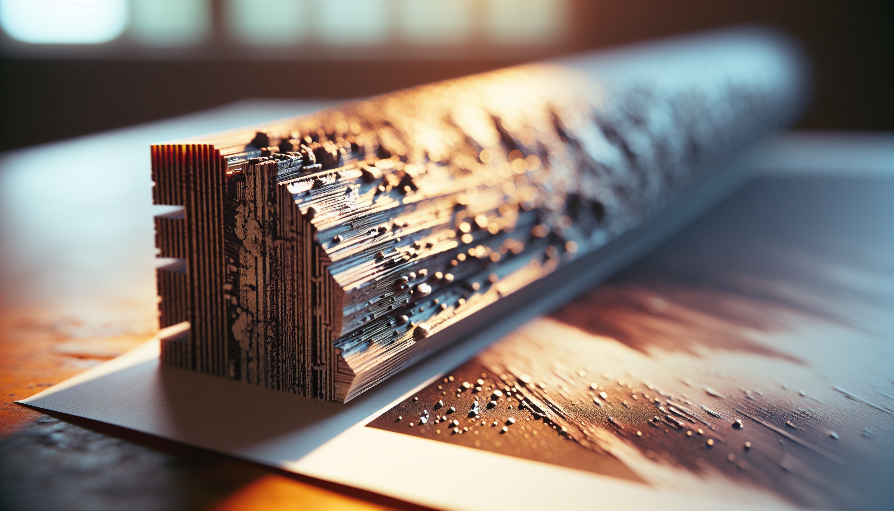
Grain, in particular, refers to the natural lines or fibers seen in paper, wood, or fabric. It’s an attribute that can define the tactile and visual experience of a design. For instance, in paper and fabric, grain affects how the material behaves when folded, printed, or cut. Designers who understand and utilize grain to their advantage can create works that not only look appealing but also feel intentional and organic.
Texture, on the other hand, relates to the surface quality of a material. It can be smooth, rough, glossy, or matte, each bringing a different perception and sensory experience to the viewer. In graphic design and printing, texture can be simulated or real, with simulated textures being created through visual effects and real textures being a physical attribute of the material itself.
The Science Behind Grain and Texture
Understanding the science behind grain and texture helps designers make informed decisions about materials and processes. Grain direction in paper, for example, affects how it absorbs ink and reacts to environmental changes. A paper’s grain can either run parallel to its longest side (long grain) or its shortest side (short grain). Knowing this can influence design choices, such as binding techniques and print alignment, to prevent warping and ensure a clean finish.
Texture impacts not only the visual appeal but also the functionality of a printed piece. A high-gloss texture might be ideal for vibrant photo prints, whereas a matte texture could be better for readability in text-heavy documents. In terms of materials, texture can affect ink adhesion and the overall durability of the print. This scientific approach to grain and texture empowers designers to leverage these elements to create compelling and lasting designs.
The Aesthetic Appeal of Imperfection
Embracing the beauty of imperfection is a design philosophy that aligns with the Japanese concept of wabi-sabi, which finds beauty in the imperfect, impermanent, and incomplete. This aesthetic values simplicity, asymmetry, and the natural processes that contribute to an object’s form. In the context of design, allowing grain, texture, and printing flaws to be part of the final piece can create a sense of authenticity and warmth that resonates with audiences.
Embracing Printing Flaws for Unique Design Elements
Printing flaws are often seen as mistakes to be corrected, but they can also be embraced as unique design elements that add character and depth to a piece. These flaws might include ink smudges, color variations, or slight misalignments. Instead of seeing these as errors, they can be incorporated into the design to create a one-of-a-kind piece that stands out from the rest.
One way to embrace printing flaws is through the use of experimental print techniques that intentionally introduce variability into the process. Techniques such as letterpress printing or risograph printing are known for their distinctive results, which often include visible textures and slight misregistrations that add charm and interest. These techniques can be particularly effective for projects that aim to convey a sense of creativity and individuality.
Moreover, the digital age has given rise to software that can simulate printing flaws for use in digital designs. Designers can apply effects that mimic the look of aged paper, distressed textures, or hand-printed elements, allowing them to infuse digital works with the same warmth and authenticity that traditional printing flaws provide.
Techniques for Integrating Printing Flaws
Integrating printing flaws into a design requires a strategic approach. Here are some techniques to consider:
- Selective Application: Use flaws selectively to highlight specific areas or elements of your design. This can draw the viewer’s attention and create a focal point.
- Contrast and Complement: Balance printing flaws with clean, precise elements to create contrast. This can enhance the overall visual impact and make the imperfections stand out more intentionally.
- Layering: Overlaying multiple textures and patterns can create a rich, complex design where flaws contribute to the depth and visual interest.
- Storytelling: Use flaws to tell a story or convey a message. For example, a weathered texture might symbolize the passage of time or a vintage aesthetic.
Video Resource
For a deeper dive into how imperfections can enhance your design projects, check out this informative video: “The Beauty of Imperfection in Design” by Design Channel. 🎥
Comparative Analysis of Design Choices
To illustrate the impact of embracing imperfections in design, consider the following comparative analysis of design choices. The table below compares traditional perfection-focused design with imperfection-embracing design across various criteria:
| Criteria | Perfection-Focused Design | Imperfection-Embracing Design |
|---|---|---|
| Visual Appeal | Sleek, polished, often sterile | Warm, authentic, character-rich |
| Texture | Uniform, smooth | Diverse, tactile |
| Audience Perception | Professional, modern | Artisanal, unique |
| Flexibility | Limited by precision requirements | Adaptable, embraces variability |
| Emotional Impact | Neutral, detached | Engaging, relatable |
As the table demonstrates, embracing imperfections can transform the aesthetic and emotional impact of a design, offering an alternative that resonates more deeply with audiences seeking authenticity and individuality.
The Future of Design: Trends and Predictions
The design world is continually evolving, and the embrace of imperfections is poised to play a significant role in shaping future trends. As consumers become more aware of and interested in sustainability, authenticity, and storytelling, designs that incorporate natural elements and imperfections will likely become more prevalent. This shift is already being seen in the popularity of handmade, artisanal products and the resurgence of traditional craft techniques.
Designers are also increasingly using technology to blend the old with the new. Digital platforms are making it easier to simulate traditional imperfections in a digital space, allowing for a seamless fusion of handmade charm with modern convenience. This trend reflects a broader movement towards design that is both aesthetically pleasing and deeply meaningful.
As we look to the future, it is clear that the appreciation for imperfections will continue to grow, inspiring designers to create works that are not only visually stunning but also emotionally resonant and culturally relevant. By embracing the beauty of imperfection, designers can push the boundaries of creativity and craft designs that stand the test of time.
Conclusion
In embracing the beauty of imperfection, particularly in the realms of grain, texture, and printing flaws, we explore a profound shift in design aesthetics that challenges the traditional pursuit of perfection. This article has journeyed through the intricate world of design where imperfections are not only accepted but celebrated, revealing how these unique characteristics add depth, authenticity, and charm to our creative endeavors.
We began by delving into the historical context, acknowledging how imperfections have long been an intrinsic part of artistic and creative processes. From the unique brush strokes of master painters to the distinct fingerprints of handcrafted pottery, the allure of imperfection has been present throughout history. This historical lens allowed us to appreciate the roots of this appreciation and set the stage for its modern-day resurgence.
Moving into the realm of design, we discussed the concept of grain and texture as integral elements that contribute to the overall aesthetic of a piece. Grain, often found in materials like wood and paper, offers a natural, organic feel that is impossible to replicate in uniform, manufactured materials. The texture further enhances this by providing a tactile dimension that invites interaction and engagement. We highlighted how these elements can evoke emotions, create atmospheres, and enhance storytelling within design.
Printing flaws, often considered mistakes in a traditional sense, were redefined in our discussion as unique signatures of the creative process. Whether it’s a slight misalignment or an unexpected color variation, these “flaws” can transform a standard print into something truly unique and personal. We explored how embracing these imperfections can lead to innovative design solutions and push creative boundaries.
The digital age, with its focus on precision and perfection, might seem at odds with this philosophy. However, we explored how technology can actually complement the embrace of imperfection. Digital tools and techniques can mimic and enhance the organic qualities of grain and texture, providing designers with the flexibility to integrate these elements seamlessly into their work. Moreover, the rise of digital platforms has made it easier for artists and designers to share their imperfect creations with a global audience, fostering a community that values authenticity over flawlessness.
Throughout this exploration, the underlying message has been clear: embracing imperfections in design is not about settling for less, but about recognizing and valuing the uniqueness that these elements bring. Imperfections tell a story, create connections, and imbue designs with a warmth and humanity that perfection often lacks. By shifting our perspective, we can unlock new levels of creativity and innovation.
In conclusion, the beauty of imperfection is not just a design trend; it is a mindset that encourages us to look beyond the surface and appreciate the intrinsic value of uniqueness. It invites us to be bold in our creativity, to take risks, and to find beauty in the unexpected. As we navigate a world that often demands perfection, let us remember the words of Leonard Cohen: “There is a crack in everything, that’s how the light gets in.”
We encourage you, our readers, to reflect on how you can embrace imperfections in your own creative processes. Share your thoughts, experiences, and creations with us—let’s celebrate the charm of the imperfect together. Your insights and interpretations enrich this ongoing conversation and help build a community that values authenticity in design.
Feel free to comment below or connect with us on social media platforms. Share this article with fellow creatives who might find inspiration in the beauty of imperfection. By spreading the word, you contribute to a growing movement that celebrates the unique, the flawed, and the beautiful. 🌟
For further reading on the influence of imperfection in design, you might find these resources insightful:
– “The Wabi-Sabi Way: A Japanese Art of Imperfection” [https://example.com/wabi-sabi-way]
– “Why We Love Imperfection: The Science Behind Flaws” [https://example.com/science-of-flaws]
Let us continue to explore, create, and celebrate the beauty of imperfection in all its forms.

Toni Santos is a visual poet and botanical dreamweaver, archiving the ephemeral beauty of dreams through nature’s delicate language.
In his artistic universe, every petal, vine, and root becomes a memory—an echo from the subconscious—preserved in time like pages from an ethereal journal. Toni treats plants not just as living beings, but as dream-symbols: vessels of forgotten feelings, silent wishes, and secret stories waiting to unfold.
His work is rooted in the belief that nature holds the vocabulary of dreams. Through botanical compositions, symbolic floral creations, and enchanted visual studies, he gives form to the unseen — the moment between sleep and wakefulness, where memory fades and imagination begins.
As the visionary behind Vizovex, Toni curates collections that feel like fragments of a dreamscape: moss-filled glass jars, mythic flowers, ancient botanical symbols reimagined. These creations invite you to explore your inner worlds and reawaken your sense of wonder.
His work is a tribute to:
The dreamlike language of plants and natural symbols.
The quiet messages found in forgotten moments.
The art of recording the soul’s memories in organic form.
Whether you’re a seeker of meaning, a lover of myth, or someone who drifts between the symbolic and the real, Toni welcomes you to explore an archive of dreams — one petal, one relic, one timeless whisper at a time