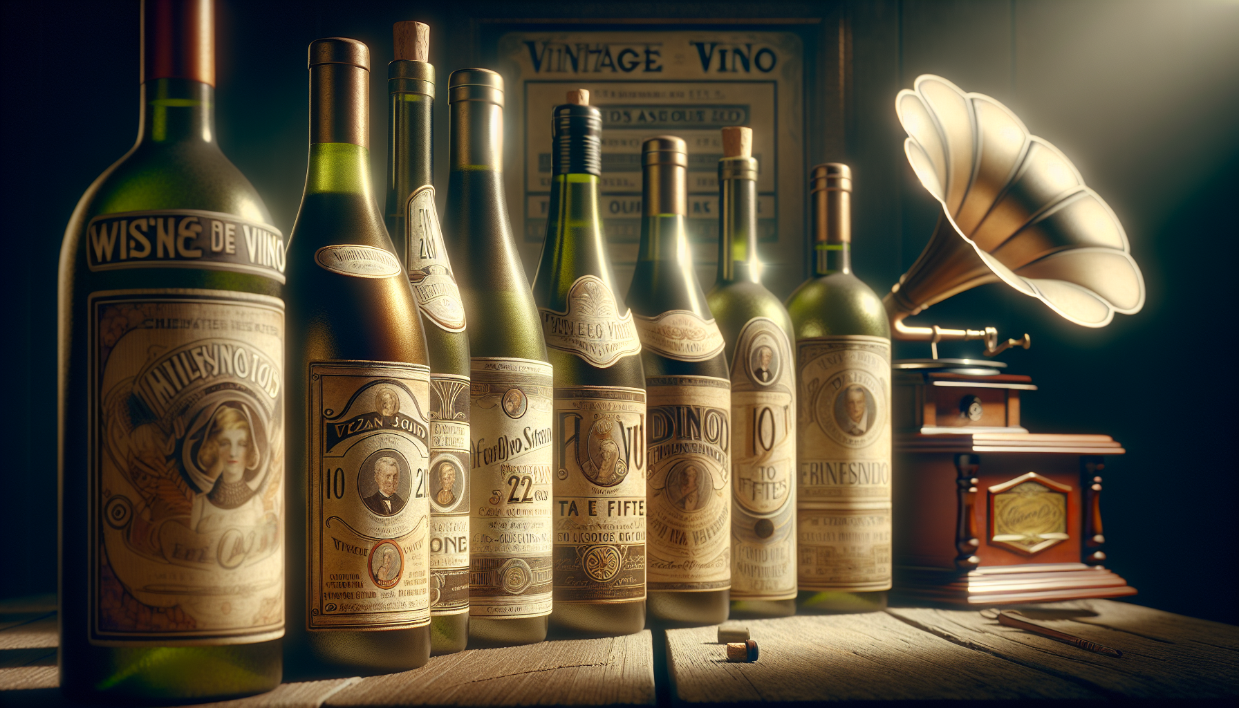
In the enchanting world of wine, where each bottle holds a story fermented through time and tradition, there lies an often-overlooked canvas that has its own tale to tell: the wine label. These small pieces of art are more than just identifiers of the liquid inside; they are windows into the past, reflections of the cultural zeitgeist, and testament to the artistry of their creators. Our journey today will take us back to a particularly vibrant era in wine label design, spanning the Roaring Twenties to the Fabulous Fifties. This was a time when bold aesthetics and innovative designs mirrored the dynamic changes in society, from the jazz-infused exuberance of the 1920s to the chic sophistication of the post-war 1950s. 🍷
As we peel back the layers of these decades, we’ll explore how the wine labels of the 1920s echoed the daring spirit of the age. This was a period marked by significant societal shifts, where prohibition in the United States led to creative subterfuges and ingenious branding strategies. Across the Atlantic, European labels boasted intricate designs that often featured Art Deco influences, capturing the essence of luxury and modernity. Moving into the 1930s, the Great Depression influenced a shift in artistic approach, prompting designers to convey a sense of reliability and tradition, thus offering a comforting promise of quality in uncertain times.
The post-war era of the 1940s and 1950s introduced a wave of optimism and a fascination with futuristic themes, which was vividly expressed through vibrant colors and playful typography in wine label design. These labels not only marketed the allure of the wine itself but also tapped into the aspirational desires of consumers, promising an escape into a world of elegance and pleasure. Throughout this blog, we’ll delve into specific examples of notable labels, the artists behind them, and the evolving trends that defined this golden age of wine artistry. So, pour yourself a glass and join us as we uncork the history and creativity bottled up in the wine labels of yesteryear. 🥂
The Evolution of Wine Labels: From Art Deco to Mid-Century Modern
The art of wine labeling has evolved significantly from the Roaring Twenties through the Fabulous Fifties, reflecting broader cultural and artistic movements. In the 1920s, the emergence of Art Deco had a profound impact on various aspects of design, including wine labels. This era was characterized by bold geometric patterns, rich colors, and lavish ornamentation. The economic boom post-World War I led to a consumer culture that prized luxury and sophistication, which was mirrored in the intricate and opulent designs of wine labels.
As we moved into the 1930s, the Great Depression brought about a shift in both economic conditions and artistic expression. Wine labels began to adopt a more subdued color palette and simplified designs, emphasizing quality and tradition. This change was not only a reflection of the economic hardship of the time but also a strategic marketing approach to convey stability and reliability. During the 1940s, World War II further influenced wine labeling. Materials were scarce, and many labels were printed in a minimalist style, using muted colors and straightforward typography.
The Fabulous Fifties saw a resurgence of economic prosperity, which was reflected in the resurgence of bold and colorful designs. Mid-Century Modernism influenced this era, bringing a fresh, clean aesthetic to wine labels. These labels often featured abstract designs, organic shapes, and a vibrant color palette, capturing the optimistic spirit of the time. The artistry of wine labels from the Roaring Twenties to the Fabulous Fifties provides a fascinating insight into the cultural and economic trends of each decade. To see these transitions visually, check out this video from the Vintage Wine Channel.
The Artistic Techniques Behind Vintage Wine Labels
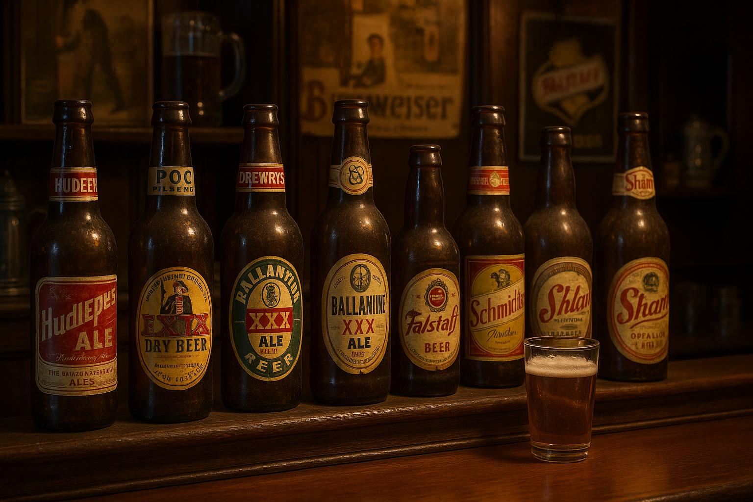
The craftsmanship involved in creating wine labels during this era is truly a testament to the artistic skill of the designers. In the 1920s and 1930s, many labels were created using lithography, a printing technique that allowed for fine details and vibrant colors. This method was labor-intensive and required a high level of expertise, but it resulted in labels that were both beautiful and durable. As the decades progressed, advances in printing technology allowed for more experimentation with materials and textures, adding a tactile dimension to the visual appeal of wine labels.
Many wine producers sought to distinguish their products by commissioning custom illustrations and typographic elements that reflected their brand identity. This was a time when branding was becoming increasingly important, and a unique wine label could capture the attention of consumers in a crowded market. Designers employed a range of techniques, from hand-drawn illustrations to intricate embossing and foil stamping, to create labels that were not only visually striking but also conveyed a sense of quality and exclusivity.
The artistic choices made in the creation of wine labels were not solely for aesthetic purposes; they were also strategic marketing decisions. The color scheme, typography, and imagery used on a label could evoke certain emotions or associations, influencing consumer perceptions and purchasing decisions. For instance, the use of gold foil and ornate designs might suggest a sense of luxury and premium quality, while a more minimalist approach might convey sophistication and modernity. This balance of artistry and marketing is what makes vintage wine labels a fascinating area of study.
Comparative Analysis: Wine Labels of the Twenties vs. the Fifties
| Element | 1920s Wine Labels | 1950s Wine Labels |
|---|---|---|
| Design Style | Art Deco, with bold geometric patterns and lavish ornamentation. | Mid-Century Modern, featuring abstract designs and vibrant colors. |
| Color Palette | Rich and luxurious, with gold and deep hues. | Bright and optimistic, with a focus on pastels and primary colors. |
| Materials | High-quality paper with intricate embossing and foil stamping. | Innovative use of textures, incorporating new printing techniques. |
| Typography | Ornate and decorative, with a focus on elegance. | Clean and bold, often using sans-serif fonts. |
As you can see from the table above, the transition from the 1920s to the 1950s involved not only changes in artistic style but also in the perception of what a wine label should convey. In the 1920s, the emphasis was on luxury and sophistication, with labels designed to reflect the opulence of the era. By the 1950s, the focus had shifted to a more modern, approachable aesthetic, mirroring the optimistic and forward-thinking spirit of the time.
For a more detailed exploration of this evolution, I recommend watching this insightful video on vintage wine labels, which delves into the artistic trends and cultural influences that shaped these designs.
The Role of Branding in Wine Label Design
Branding has always played a crucial role in the design of wine labels, and this was especially true during the early to mid-20th century. As the wine industry became more competitive, producers realized that a distinctive label could set their product apart from the competition. This led to a greater emphasis on brand identity and storytelling through design, with labels serving as a visual representation of the winery’s heritage, values, and unique characteristics.
In the 1920s, branding was often expressed through elaborate illustrations and detailed typography, conveying a sense of history and tradition. Wine producers would incorporate elements that highlighted their region of origin, grape varietals, or winemaking techniques, creating a narrative that appealed to discerning consumers. This focus on storytelling became even more pronounced in the 1950s, as marketing strategies evolved to include not just the product itself, but the lifestyle it represented.
Today, the legacy of these vintage wine labels continues to influence modern branding practices. The emphasis on authenticity, heritage, and craftsmanship remains a key aspect of successful wine marketing. To understand how branding strategies have evolved over the decades, take a look at the video below, which explores the artistry and impact of wine labels from this transformative era.
- Understand the historical context and artistic influences behind wine labels.
- Explore the techniques and materials used in label design from the 1920s to the 1950s.
- Discover the role of branding and storytelling in creating a distinctive wine identity.
By examining the artistry and evolution of wine labels from the Roaring Twenties to the Fabulous Fifties, we gain a deeper appreciation for the cultural and creative forces that have shaped the world of wine. 🍷
Conclusion
Certainly! Here’s a conclusion for your article on the artistry of wine labels from the 1920s to the 1950s:
—
In conclusion, our exploration of the artistry of wine labels from the Roaring Twenties to the Fabulous Fifties reveals a vibrant tapestry of creativity, culture, and history. This era, marked by significant social and economic changes, witnessed the emergence of wine labels as more than just identifiers of a product—they became canvases that reflected the zeitgeist of their times. From the opulence and excess of the 1920s to the post-war optimism and innovation of the 1950s, wine labels not only marketed a beverage but also encapsulated the spirit of an era.
Throughout our journey, we delved into the distinctive design elements that characterized these labels. The 1920s brought about an Art Deco influence, with geometric shapes and bold colors symbolizing the dynamism of the Jazz Age. Moving into the 1930s and 1940s, labels began to embody a sense of nostalgia and patriotism, often featuring pastoral imagery and classic fonts as a nod to tradition and stability during turbulent times. The 1950s, meanwhile, saw a shift towards more modern and playful designs, mirroring the era’s technological advancements and cultural shifts.
The significance of these labels extends beyond their aesthetic appeal. They serve as cultural artifacts that offer insights into consumer behavior, marketing trends, and the socio-political context of their time. Wine labels from this period also highlight the interplay between art and commerce, demonstrating how design can influence consumer perception and drive brand success.
Understanding the history and evolution of wine labels enhances our appreciation of wine as a cultural product. It underscores the importance of design in storytelling and brand identity, lessons that remain relevant in today’s marketing landscape. As we sip a glass of wine adorned with a meticulously crafted label, we partake in a tradition that celebrates both the artistry of winemaking and the creativity of design.
As we conclude this exploration, I encourage you to take a closer look at the wine labels you encounter. Consider the stories they tell and the artistic choices behind them. Whether you’re a wine enthusiast, a design aficionado, or simply curious, there’s much to discover in the world of vintage wine labels. 🍇
Feel free to share your thoughts and insights on this fascinating topic. Engaging in a conversation about the artistry of wine labels not only broadens our understanding but also fosters a community of like-minded individuals who appreciate the fusion of art and history in everyday objects. If this article inspired you, consider sharing it with friends and family. Who knows, it might spark their interest in this captivating subject too!
For further reading on the evolution of wine label design, you can explore resources such as the Wine Spectator (https://www.winespectator.com) and Decanter (https://www.decanter.com), which offer in-depth articles on the subject. These platforms provide a wealth of information for those eager to delve deeper into the world of wine and its artistic expressions.
In closing, let’s raise a glass to the timeless elegance and enduring charm of vintage wine labels. Here’s to the past, present, and future of wine artistry! 🥂
—
This conclusion wraps up your article by summarizing key points, emphasizing the topic’s significance, and encouraging reader engagement. It maintains a professional yet engaging tone, ideal for inspiring further interest in the subject.

Toni Santos is a visual poet and botanical dreamweaver, archiving the ephemeral beauty of dreams through nature’s delicate language.
In his artistic universe, every petal, vine, and root becomes a memory—an echo from the subconscious—preserved in time like pages from an ethereal journal. Toni treats plants not just as living beings, but as dream-symbols: vessels of forgotten feelings, silent wishes, and secret stories waiting to unfold.
His work is rooted in the belief that nature holds the vocabulary of dreams. Through botanical compositions, symbolic floral creations, and enchanted visual studies, he gives form to the unseen — the moment between sleep and wakefulness, where memory fades and imagination begins.
As the visionary behind Vizovex, Toni curates collections that feel like fragments of a dreamscape: moss-filled glass jars, mythic flowers, ancient botanical symbols reimagined. These creations invite you to explore your inner worlds and reawaken your sense of wonder.
His work is a tribute to:
The dreamlike language of plants and natural symbols.
The quiet messages found in forgotten moments.
The art of recording the soul’s memories in organic form.
Whether you’re a seeker of meaning, a lover of myth, or someone who drifts between the symbolic and the real, Toni welcomes you to explore an archive of dreams — one petal, one relic, one timeless whisper at a time